I would like to formally apologise for my not great site design. Designing in context is hard and WordPress is harder. I hope to resolve the former, but unfortunately until I learn to code I must fight the latter in a sisyphean war, ever getting closer and farther from my goal of a comprehensible blog.
I’ve used hyperlinks as in-text citations for these posts, as they feel less clunky with my blog writing style. Each entry has its own bibliography at the end.
Week 3: Rebellion in design and the Arts and Crafts Movement
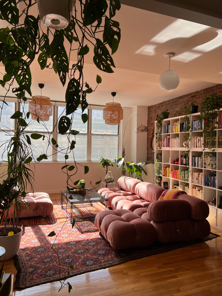
Within our homes we’re subject to design at every moment; Visual design especially. The way we decorate or design a space plays a major role in how we feel about it or ourselves, and our comfort being there.
Similarly to clothing and other forms of self-expression, we show a lot of who we are and what we think of the world through our homes, or perhaps what we want to see in it.
It’s hard not to sort yourself into some kind of category when it comes to your design preferences. As outlined by Brooke Viegut and intertviewees in an article for PRINT Magazine, “The industry gives you those boxes because that’s the most efficient way for them to sort you… It’s a false front, monetizing a sense of individuality through products sold to millions”. Modern design Aesthetics and movements are more often than not a result of consumerism and business deals, something being fought back against by many people who choose to design with maximalism in mind. Young people online are frequently turning their nose up at “Sad beige” aesthetics, in favour of older styles and eclectic decorating.
Sometimes the most peaceful spaces are a rebellion themselves.
Image cr. Michelle Pham. via PRINT Magazine.
The British Arts and Crafts movement, and by extent the American Craftsman style, was born out of similar design resistance and aesthetic warfare. Coming off the industrial revolution, designers were at odds over the plethora of mass-produced, unnaturally ornate everything swarming the market.
Arts and Crafts favoured natural materials, handmade items, and Tudor/gothic aesthetics with a penchant for natural/organic shape language.
Both movements are responding to an environment of consumerism, capitalism, and rapid global social change, sharing dreams of living amongst nature or in a world all your own. Amidst the ever-present global tension of war, politics, and climate change, self-expression and finding safety in how we design our spaces is one of the few pieces of control we have left over our environments.
Bibliography
Clark, V 2023, How to decorate for happiness and mental wellbeing, House & Garden
Hohenadel, K 2025, What Is a Craftsman House?, The Spruce.
Knierim, A 2022, Learn All About Arts and Crafts-Style Homes, The Spruce.
The Art Story 2017, The Arts & Crafts Movement Overview, The Art Story, The Art Story.
Week 4: Moodboards and Patterns


Moodboards. If they look strange I’m afraid there’s nothing I can do about the saturation. They’re more vibrant in illustrator, and the first one is strange considering I know what that art looks like. It may be a CMY vs. RGB thing. They’re screenshots as this is more accurate than the export which had the opposite problem.
Making moodboards for my patterns was interesting, as it isn’t something I usually do in my usual art practice and such. It did, however, get me thinking more about how tile patterns work and more about what I want to explore with my planty forms.
As you can tell by my moodboards, I love using different weighting of warm and cool colours in my palettes to inform the overall feeling. I also really liked monochrome tiles, though, and I found a lot of green ones.

This is one of my favourite experiments, though I couldn’t get it to tile properly for the purpose of the assignment. The original tile I used to make it got used in other work, though.
Below is one of my more final tiles, that was heavily inspired by one of my moodboard palettes. Greeen.
Both screenshots were taken from my working document in illustrator, and have the same saturation problem as above.
You’ll be happy to know in later work, I got the tile to the left to work!!

Bibliography
Anonymous n.d., Blue tile stock image, Pinterest.
Carson, E n.d., ‘Italian pattern with off white cream and green’, Pinterest.
Encaustic Tile Designs n.d., ‘Chamonix 04’, Pinterest.
Ferrier, M 2025, Skyfish Reference Sheet (Cropped).
Kaleidoscope Visuals n.d., ‘Free PFP Image, Symmetrical Art Image’, Pinterest.
Kirk, J n.d., Symmetrical pattern with eye detail, Pinterest.
Kittening, L n.d., Illustration of bird catching fish, Pinterest.
Marin, P n.d., Kaleidoscope image, Pinterest.
Rebel n.d., Optical illustion, Pinterest.
Waelchi, R n.d., Dark green patterned tiles, Pinterest.
Week 7: Pattern Reflection
This task was so. much. fun.
I was really excited for VCD since I didn’t know anything about adobe and vectors and such, and going into the class I really just wanted to learn everything I could, and I think I really got that out of this task.
Overall I’m shocked by how smoothly it went- Following changing up the shape I used (and then ending up using both in the final), I never hit any roadblocks- I followed the classwork as well as I could, and did extra experiments like the CMY Tile in the post above.
I think the biggest enemy I encountered in the process was the dreaded printer in the hallway. That bastard refused to work for me, ate my money, and made me walk on a still very painful ankle all the way down to the library to get a test print. I lived, though.
In all seriousness, the biggest challenge was working out colourways. Putting them together in the context of my patterns’ limited sections was harder than I thought. I think if I were to do this task again I’d choose a more complicated shape, or at least a different one considering the context of later steps.
All in all I don’t have a lot to say about the project, it was fun, I learned a lot about the function of Illustrator, and I’m hyped for the next task.

My working document in AI. Blurry as heck.
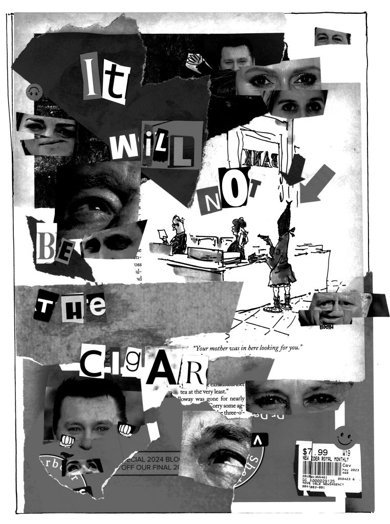
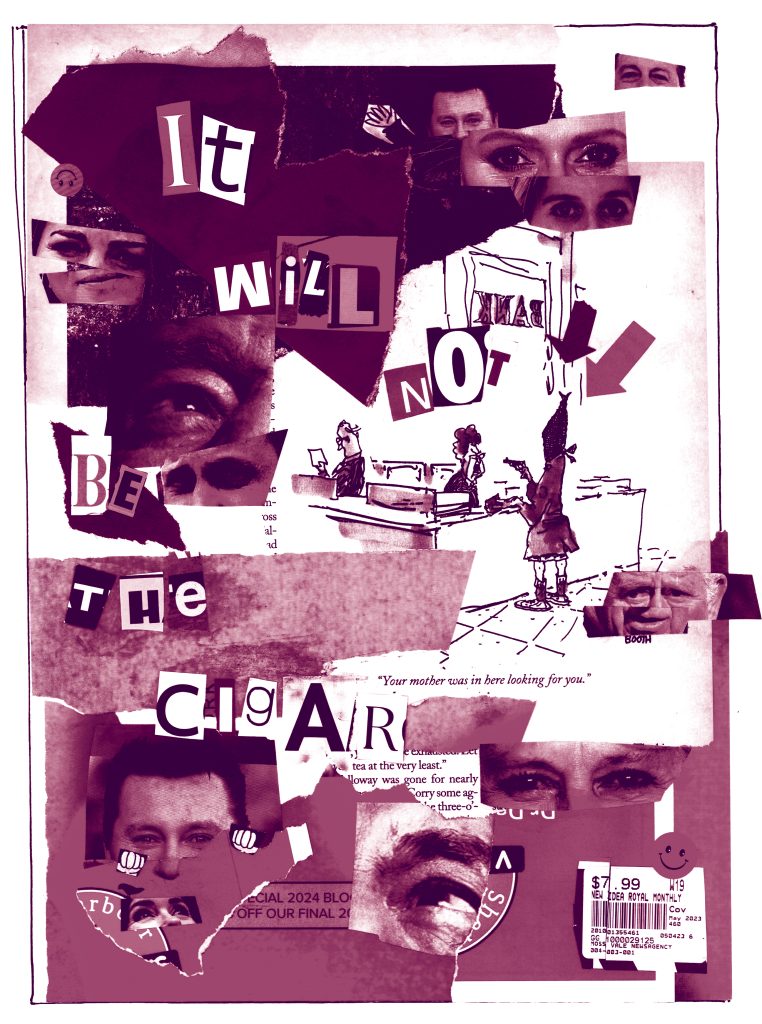
Week 8: “It will not be the cigar”
A cigar is almost as commonplace as an apple, but if I fail to make ads for cigars that are lively and original, it will not be the cigar that is at fault.
— Daedalus, Journal of the American Academy of Arts and Sciences, Special Issue: “The Visual Arts Today”, Winter 1960
The full text of my Ransom quote, taken from PaulRand.design. I love this quote, because it speaks to me mostly through my love of personifying things to make a point. It’s also easy to doctor into a play on “Close, but no cigar”, which I did for my collage, as it features a lot of political ads for the candidate in my electorate who lost by a landslide.
I think though that if I wanted to get all pretentious and academic about it, I’d say there’s a lot here about how our choices and intent as designers are vital to our work. Your heart has to be in it for a good design to be made, especially if you don’t want to spend 3x as long on it than you should, which you won’t want to if you hate it.
It’s an important thing for me to remember, as I tend to get stuck on ideas I despise while working on projects. It’s an unfortunate product of being the child of a redhead- I am notoriously stubborn.
Bibliography
Lewandowski, D 2013, Paul Rand – American Modernist, Paul Rand – American Modernist.
Week 10: Monograms

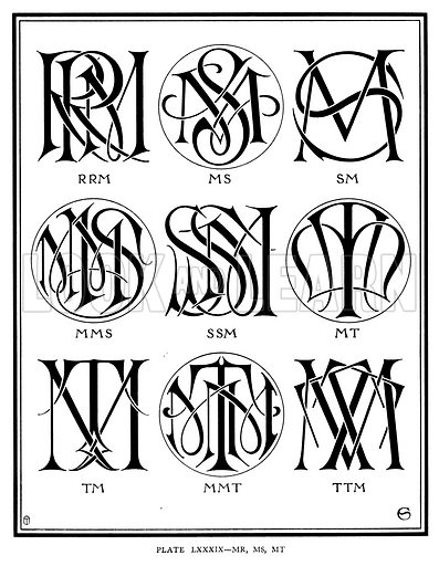
Left: Louis Vuitton Logo by Gorges Vuitton, Louis Vuitton’s Son (According to their website)
Right: RRM, MS, SM, MMS, SSM, MT, TM, MMT, TTM. Illustration for Monograms and Ciphers designed and drawn by A A Turbayne and other members of the Carlton Studio (Caxton, 1905).
Monograms are an ancient art, dating back thousands of years to when craftspeople added maker’s marks to their work as an identifier of who made it– and really, that’s what they are. A symbol that represents you, and that you were here.
The one on the left I’m sure anyone who looks at this post would know- It’s more than an individual’s icon, rather an entire brand, making a lot of people very rich off the recognition it receives.
Its off-kilter alignment gives a sense of modernity, and a sense of balance like one of those impossible looking tables that uses cool physics to function. It’s sleek, stylish, and what you’d expect from a clothing or accessories brand.
The ones on the right are from 1905, and you can tell their age by their ornateness. Modern ones do exist like this, but they’re often imitations of older styles.
I particularly like the SM one, It’s simple, similar to many more modern looking monograms, but has the more engaging font and shape language of its peers.
While monograms can still be deeply personalised, in years later on, you’ll see many designed like the ones from 1905- ones you can use made by studios of people working to put together as many as they can.
This shows more of a shift from these referring to individual artists to people, families, or even institutions. The more multipurpose nature of monograms has led to them being popularised with more than just artists.
Bibliography
Hawthorne 2023, Unravelling the History of Embriodered Monograms, Linkedin.com.
Louis Vuitton Website 2025, LV Signature Store Page, Louisvuitton.com.
O’Connor, A 2020, A Brief History of Monograms • Lakeshore Magazine, Lakeshore Magazine.
Week 13: Booklet Reflection
The booklets were a lot of fun.
Admittedly there were more bumps along the road on this task, I struggled a little with actually working out how to fill pages, but after a while and a little guidance I got into the groove.
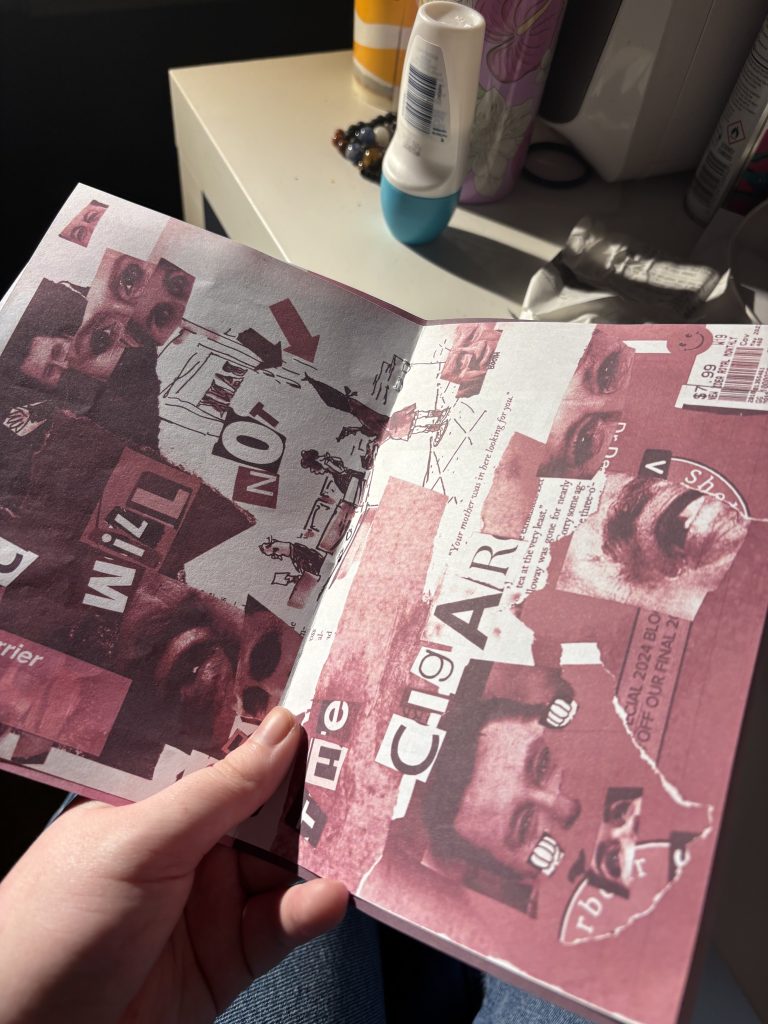
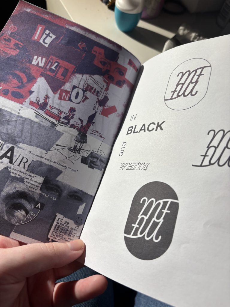
I used a lot of pink, mainly because it’s my favourite colour, and it worked well for my purposes making different colourways of my collage.
I tried a 3-colour one, and honestly it looked really cool- though we weren’t technically supposed to, so I didn’t end up using it in the final.


Several of my iterations. Some I used, others I didn’t. Also my black and white one, which was the basis for all the coloured ones.
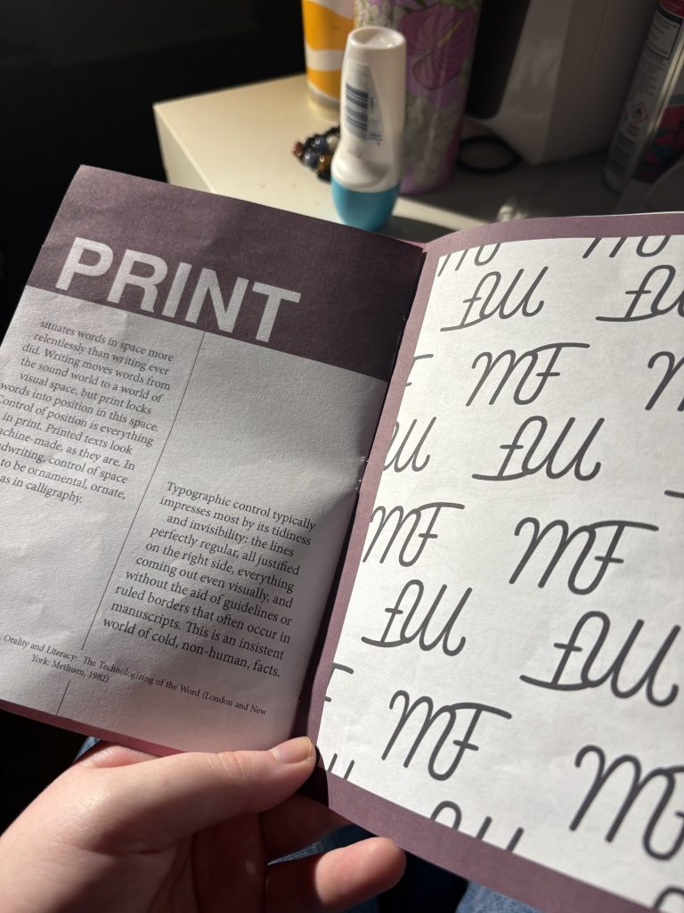
My monogram went through similar iteration, going through font after font to get mashed up into various icons.
Really the whole process was much more iterative than my patterns, which was a lot of fun in the end. Lots of playing around.
Like last time, I did a test print before I submitted the task- This one I wanted to put together as the booklet would, so I could see it in its final form.
This… was very difficult.
I went through two prints at uni before I decided I needed more help, and asked my mum when I got home. Turns out I had a ton of settings wrong, but I know how to do it now which might be the coolest thing ever.
Some spreads from my test booklet. Holy peak.
All in all this was the coolest assessment task I had this semester. I love working with physical media so this was perfect, and now I know more about how InDesign works I can use it for fun game design projects I’m working on with friends.